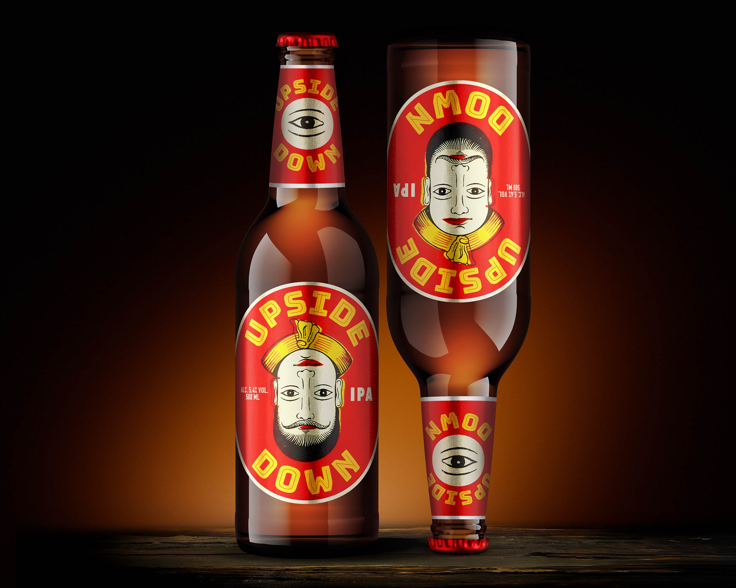
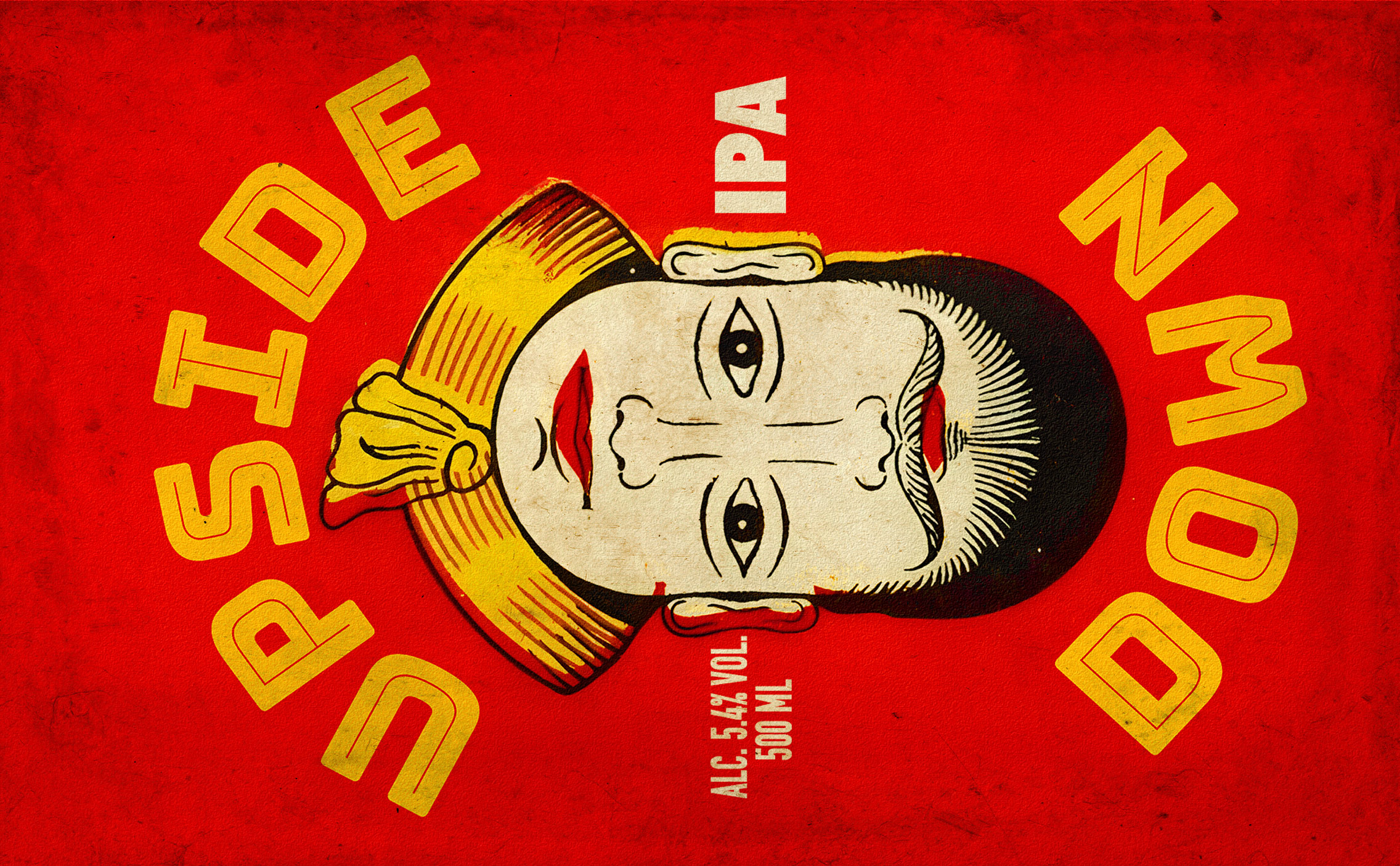
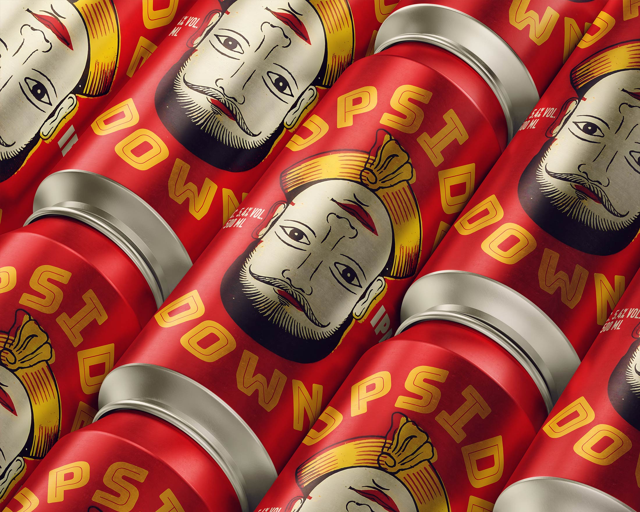
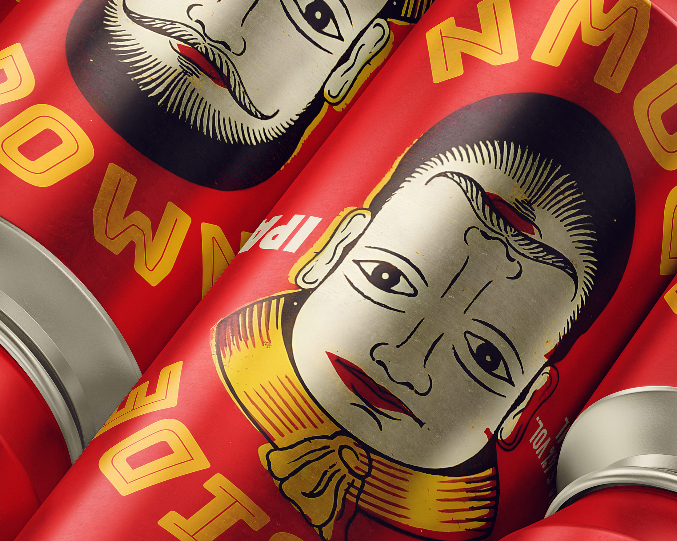
The UPSIDE-DOWN packaging concept draws inspiration from a vintage matchbox label that features two faces—an old man and a young man—each revealed depending on the orientation of the image. The packaging shifts its message depending on how it is held, offering a fresh perspective when turned upside down.
The contrast between youth and age symbolises the product’s versatility, appealing to both younger and older audiences.
This clever design invites interaction, encouraging users to engage with the packaging and discover its hidden meanings.
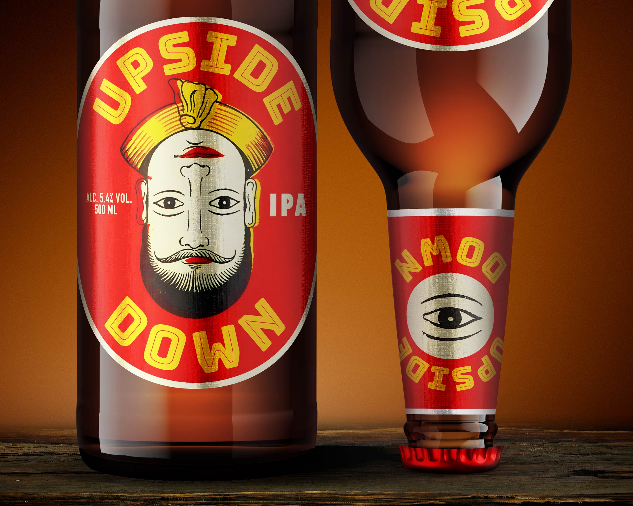