Tempranillo 0.0% — Alcohol-Free
Context
An alcohol-free Spanish Tempranillo developed for Scandinavian grocery retail. The packaging needed to communicate 0.0% alcohol immediately while retaining the character and credibility of a traditional red wine.
Challenge
The design had to avoid the clinical, minimalist language often associated with alcohol-free products. It needed strong shelf visibility, clear varietal recognition and a premium appearance suitable for the wine category.
Strategy
The product was positioned as an authentic Spanish wine experience rather than a lifestyle substitute. Traditional wine codes were combined with a direct retail hierarchy, placing both TEMPRANILLO and 0.0% ALCOHOL FREE at the centre of the communication.
Scope
Brand concept, label design, typographic hierarchy, illustration treatment, finishing specification, production-ready artwork and product visualisation.
Market
Denmark and Scandinavian grocery retail.
Outcome
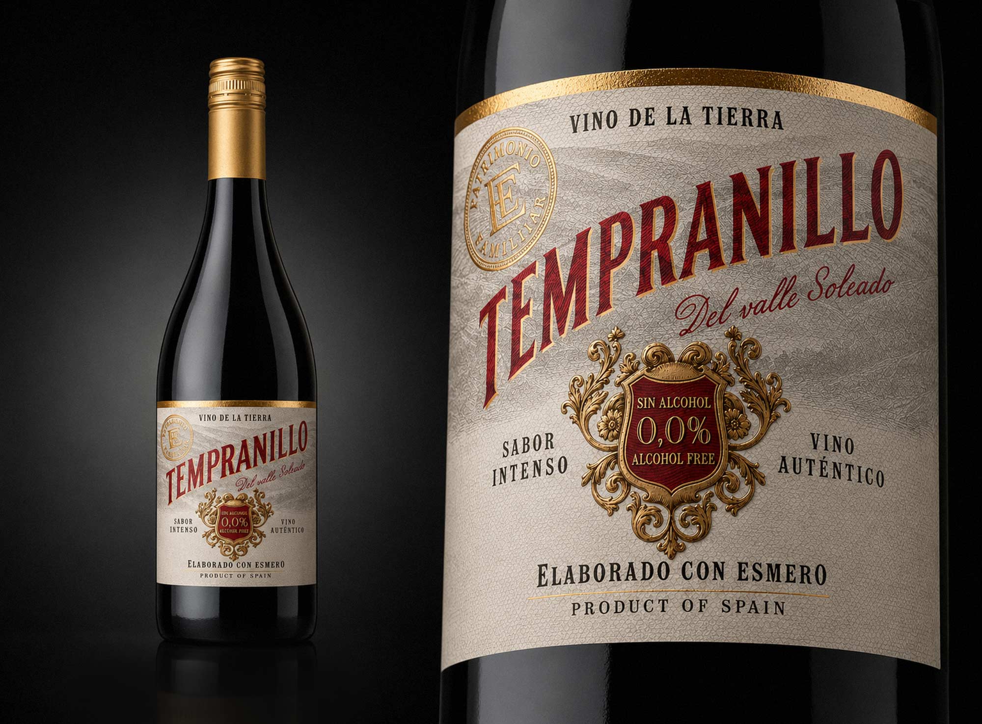
The selected design was approved and implemented on the finished bottle.
The final packaging combined immediate 0.0% recognition with the visual and tactile qualities expected from a premium Spanish wine.
Design solution
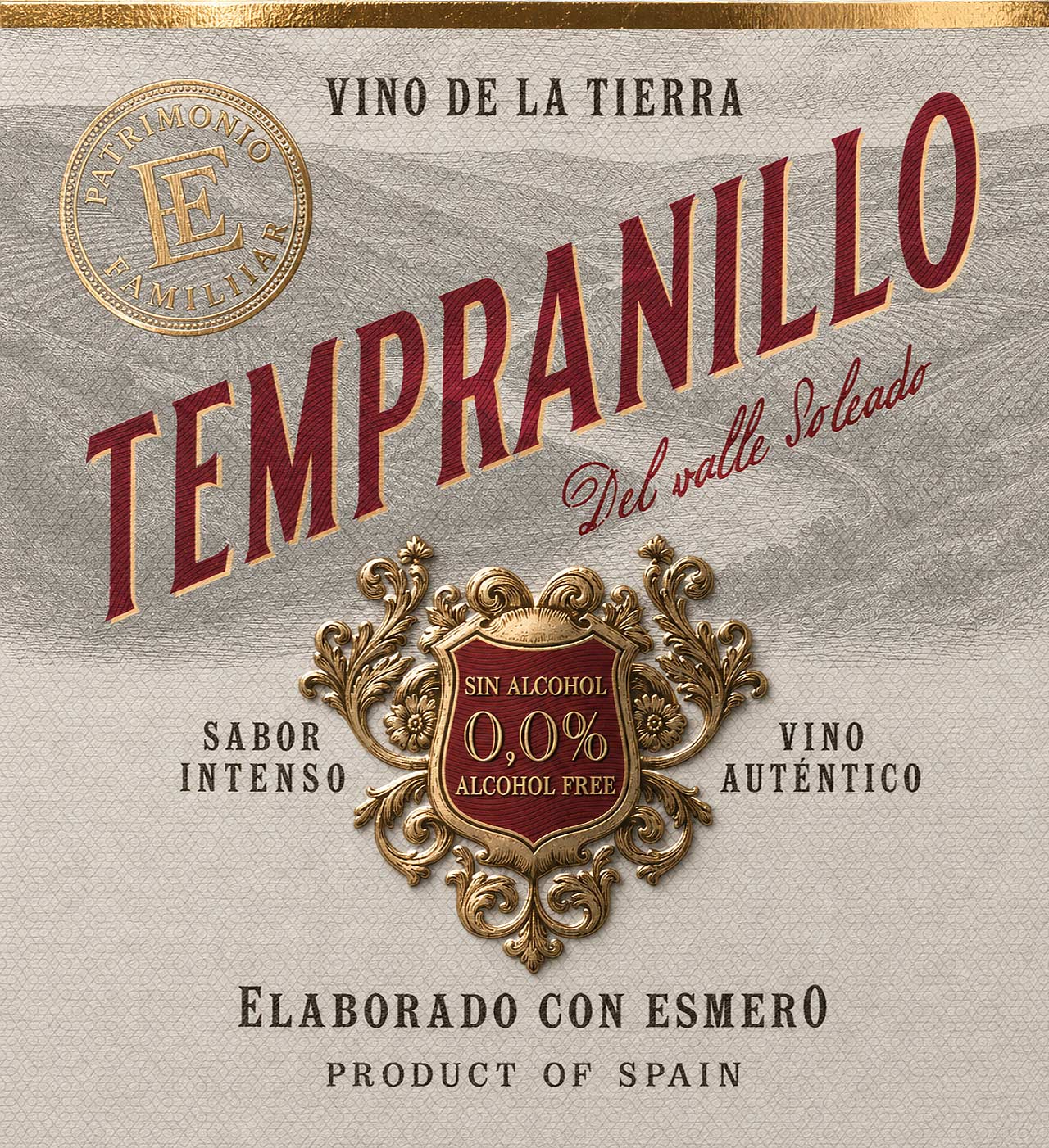
The oversized Tempranillo typography creates immediate recognition, while the central ornamental cartouche clearly communicates the alcohol-free proposition.
An engraved landscape, heraldic crest and restrained Spanish wording introduce provenance and traditional wine character. Deep wine red, black, warm grey and metallic gold create a rich but controlled visual system.
Production
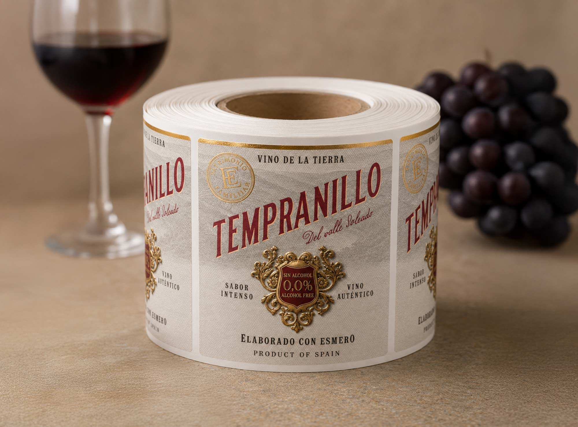
The label was printed on Fasson® Cotton White UWS — Ultra Wet Strength by Avery Dennison, a warm-white, cotton-textured paper designed to retain its appearance and adhesion in humid and chilled conditions.
High-resolution flexographic printing provided the deep wine-red typography, fine black text and detailed engraved illustration.
The label was finished with:
- reflective gold hot foil stamping on the crest, the Patrimonio Familiar seal and selected ornamental details;
- raised embossing on the central crest and typography;
- a tactile cotton-paper surface reinforcing the traditional premium character.