Rails of Andes – Chile


Design solution
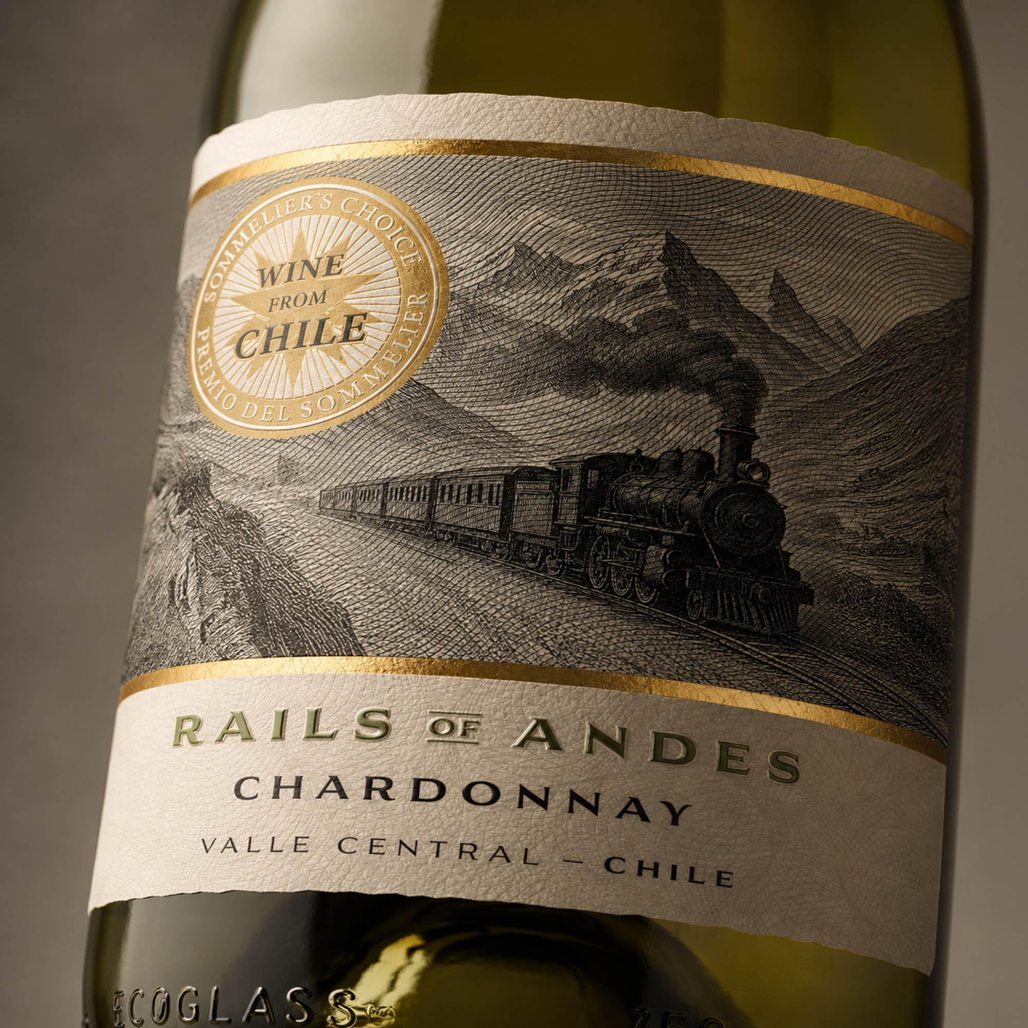
A dynamic engraving-style steam train travelling through the mountains forms the central visual element.
The monochrome illustration creates depth and historical character, while a prominent typographic band gives CARMÉNÈRE or CHARDONNAY immediate visibility. The shared composition establishes a consistent range architecture, with varietal names and colour accents differentiating the individual wines.
Production
The self-adhesive labels use high-resolution printing to preserve the fine engraved linework, small typography and tonal detail of the mountain landscape.
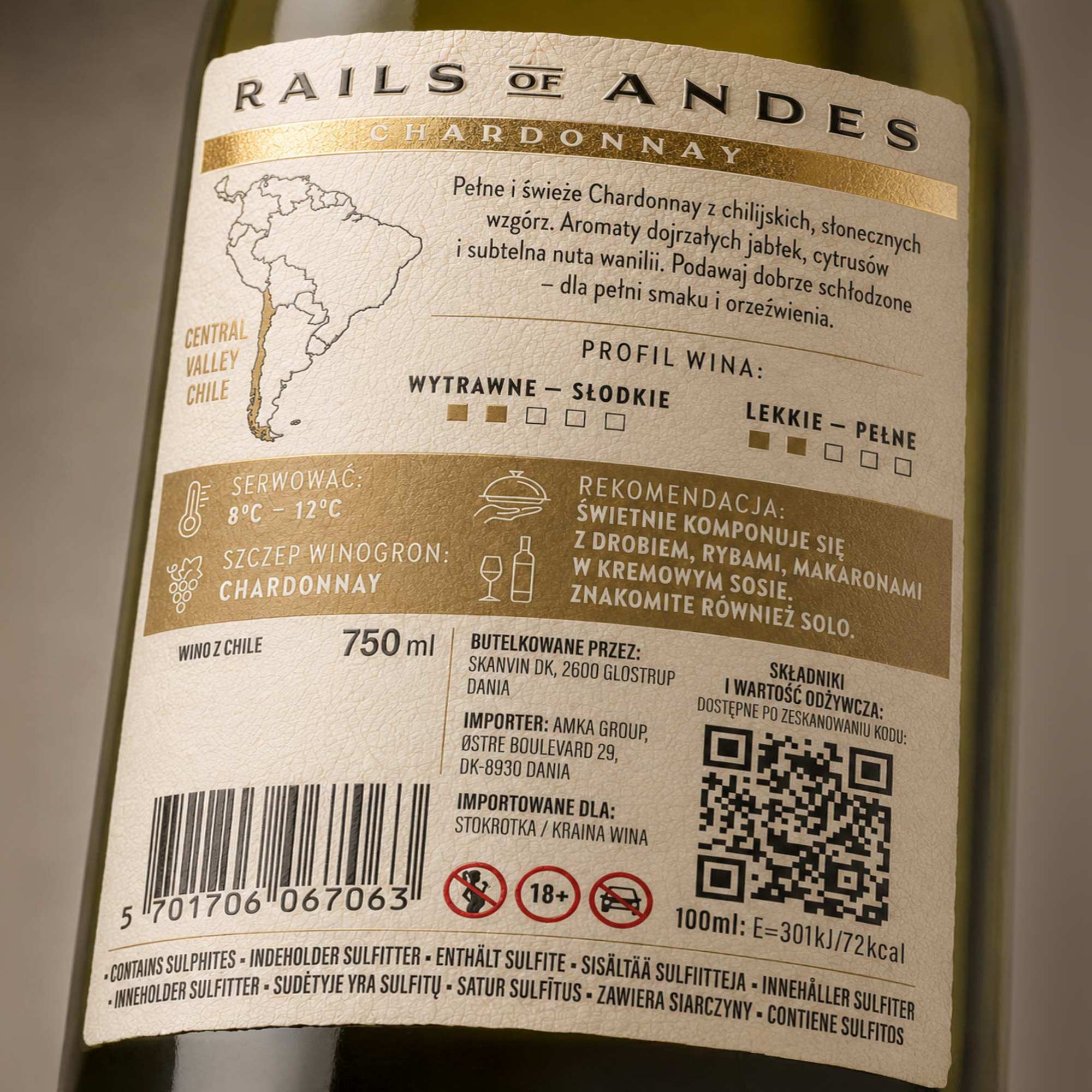
The design was prepared as production-ready artwork for application to standard wine bottles, with a clear hierarchy suitable for automated bottling and retail display.
Outcome
The selected concept was developed into a coordinated Carménère and Chardonnay range and prepared as technical artwork for the bottler.
The final identity combines Chilean provenance, strong varietal communication and a distinctive narrative rooted in the history of the Andes.
Context
A Chilean wine range comprising Carménère and Chardonnay, inspired by the historic railway that once connected Chile and Argentina across the Andes. Wine inspired by the historic Transandine Railway.
Challenge
The design needed to create a distinctive Chilean identity while maintaining clear varietal recognition and strong shelf visibility across both red and white wines.
Strategy
The brand was built around the idea of travel, engineering and discovery. The Transandine Railway provided an authentic narrative connecting the wine with the dramatic landscape and cultural heritage of the Andes.
Scope
Brand concept, naming development, label design, custom illustration treatment, range architecture, typographic hierarchy, production artwork and visualisation.
Market
Chilean wine developed for international retail and export markets.