Esencia del Sur – Wine of Chile

Design
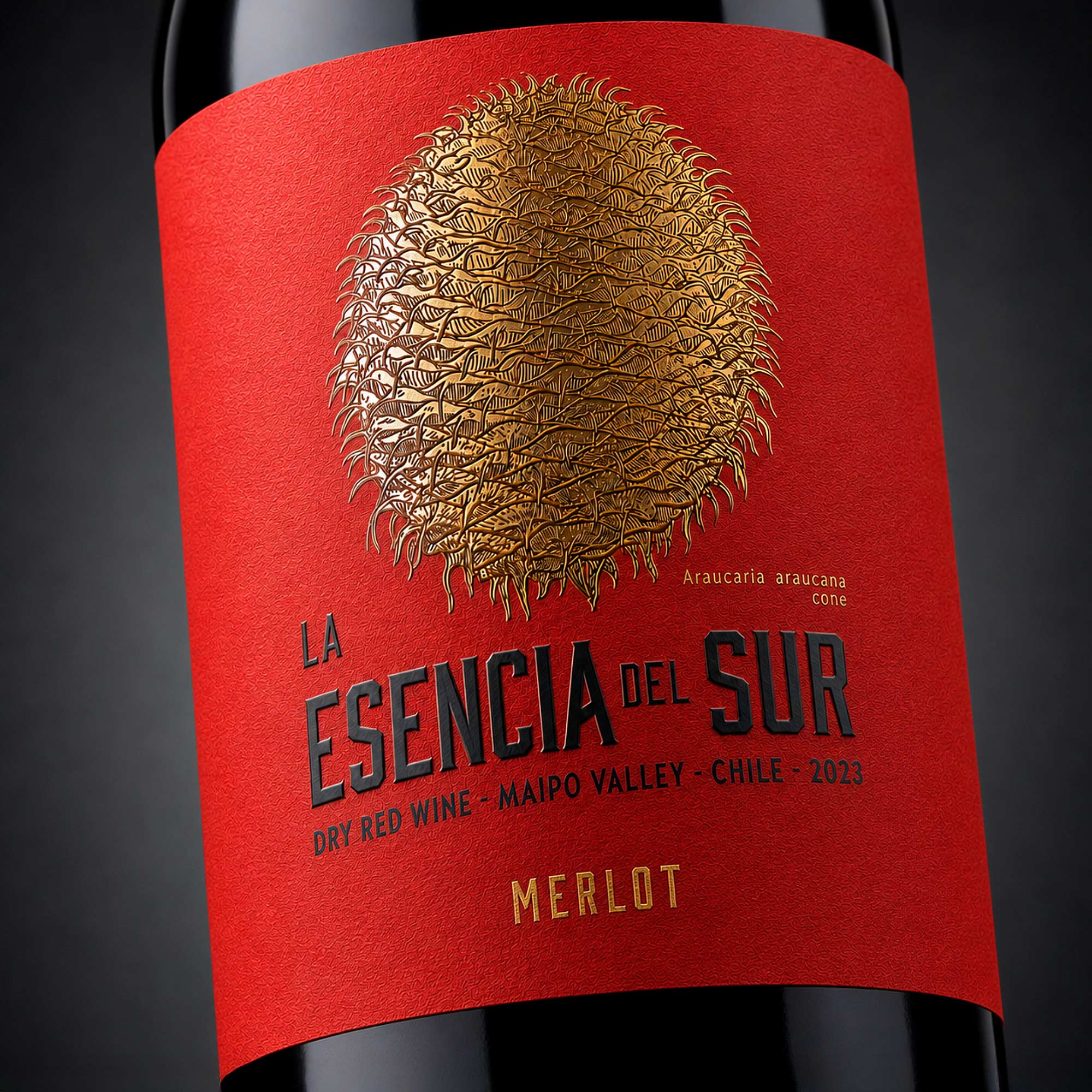
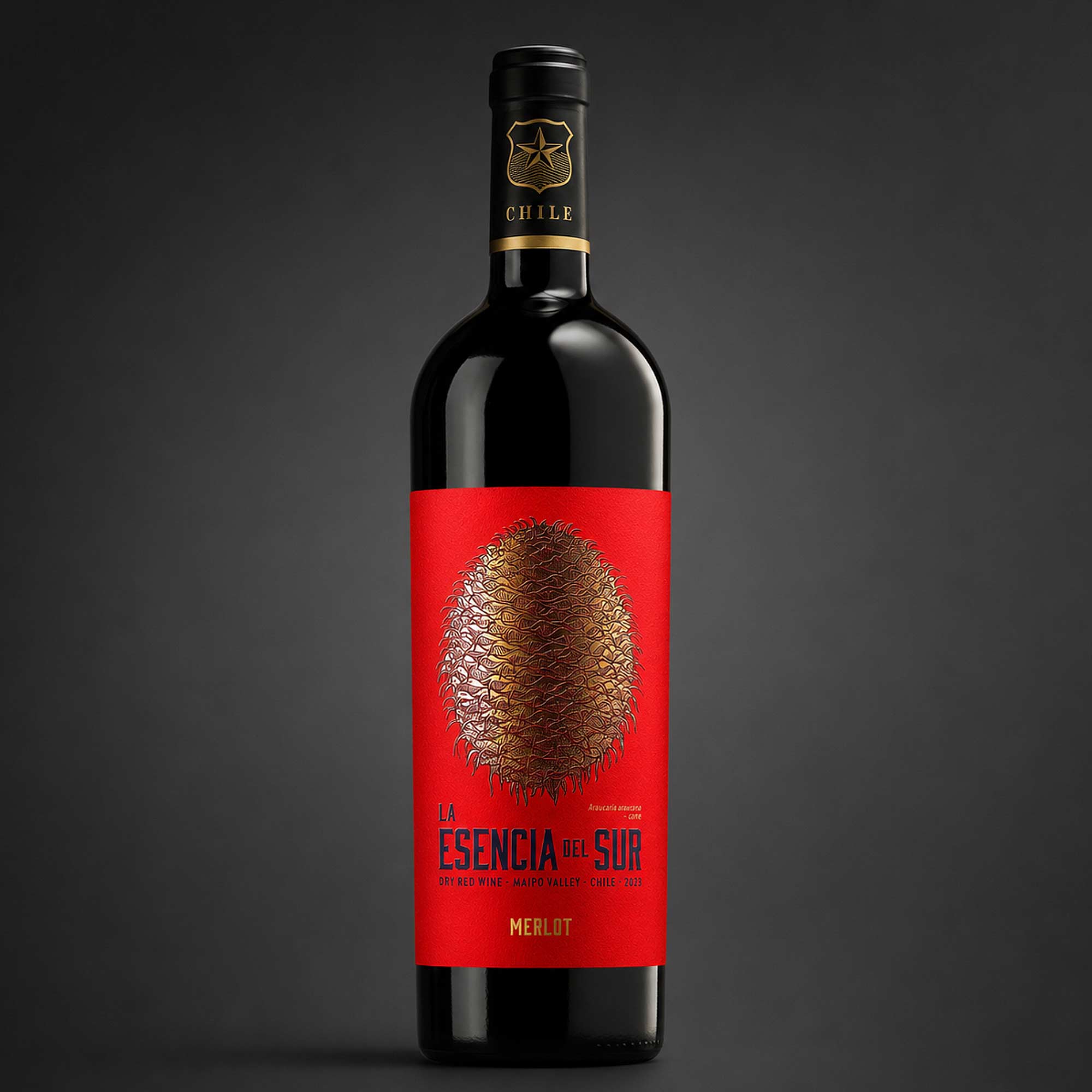
A detailed Araucaria cone dominates the composition, surrounded by restrained classical typography and ornamental framing. The deep red background conveys warmth, intensity and the expressive character of the wine, while metallic detailing introduces contrast, precision and a premium finish.
Production
The label was designed for production on a textured, wet-strength wine-label paper. The Araucaria cone and selected ornamental elements are enhanced with embossed metallic hot-stamping, creating a tactile focal point against the matte printed background.
Scope
The project included brand positioning, visual concept development, label architecture, custom illustration, typography, print preparation, selection of materials and finishes, and the development of presentation mock-ups for the final packaging.
Outcome
The final design gives Esencia del Sur a strong and recognisable identity rooted in Chilean nature and culture. Its combination of rich colour, detailed symbolism and tactile finishing creates a distinctive premium presence while remaining authentic to the wine’s origin.
Context
Esencia del Sur is a Chilean wine inspired by the dramatic landscapes, natural heritage and cultural identity of southern Chile. The design needed to communicate authenticity, strength and a clear sense of origin while retaining an elegant, premium character.
Challenge
The main challenge was to create a distinctive Chilean identity without relying on conventional vineyard imagery. The label also needed strong shelf presence and a visual language capable of combining regional symbolism with a refined contemporary presentation.
Strategy
The concept was built around the Araucaria — one of Chile’s most recognisable native trees and an important cultural symbol associated with endurance, longevity and a deep connection to the land. Its sculptural cone became the central emblem of the brand.
Market
European · International wine market